
You are using an out of date browser. It may not display this or other websites correctly.
You should upgrade or use an alternative browser.
You should upgrade or use an alternative browser.
[Photography] Raw-A-Week Mastering
- Thread starter matthewr
- Start date
Chaps
I have just arrived home from a trip to London where I had a very good lunch at Rules.
Quite a few gin and tonics, a good 3 course meal, bottle of Bordeau plus a few brandies afterwards.
I admit being slight tiddled but this thread has got me buggered.
What is it all about ?
Regards
Mick
I have just arrived home from a trip to London where I had a very good lunch at Rules.
Quite a few gin and tonics, a good 3 course meal, bottle of Bordeau plus a few brandies afterwards.
I admit being slight tiddled but this thread has got me buggered.
What is it all about ?
Regards
Mick
vuk
\o/ choose anarchy
mick.
round one ended yesterday. look here and tell us which version of the photo you like best:
http://vukfoto.com/exhib/raw01/
vuk.
round one ended yesterday. look here and tell us which version of the photo you like best:
http://vukfoto.com/exhib/raw01/
vuk.
Mike Hanson
Trying to understand...
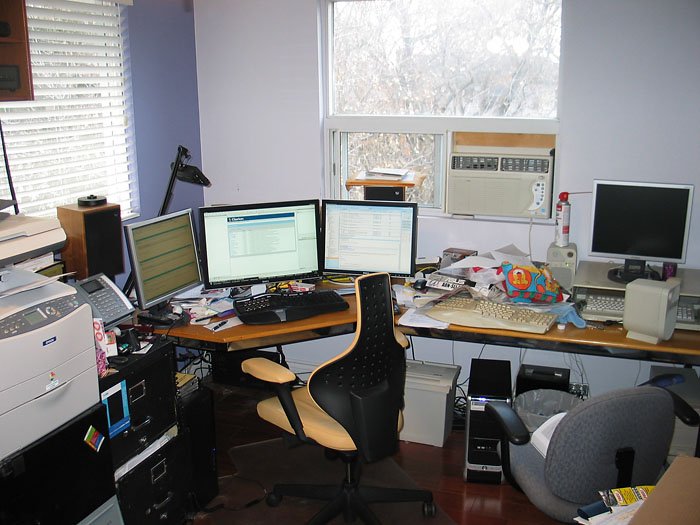
I would certainly be in the running. My computer desktop is very tidy, but my real desktop and office is another matter altogether. Of course, I spend more time staring at my displays than at the rest of my office.Mike, does your office top fox's for organization?
Mike Hanson
Joe P
Memory Alpha incarnate | mod; Shatner number = 2
Tony,
Joe
Must be some sort of mod synchronicity, as I was thinking of doing something similar, but my version would have had evil Spock lurking in the shadows.PS I did have a diferent go at really tweaking the shadow detail late last night, amazing what one finds lurking.
Joe
vuk
\o/ choose anarchy
I would certainly be in the running. My computer desktop is very tidy, but my real desktop and office is another matter altogether.
mike.
don't you have a digital camera?
vuk.
Tony L
Administrator
Must be some sort of mod synchronicity, as I was thinking of doing something similar, but my version would have had evil Spock lurking in the shadows.
I very nearly handed it in as my homework.
Tony.
vuk
\o/ choose anarchy
-=>mike<=-
why are *all* your 3rd party software hacks called "super" this and "super" that? were there non-super versions before? will the next ones be "super-duper"?
http://www.boxsoft.net/
btw--you don't have the body styles properly coded on the webpage.
vuk.
why are *all* your 3rd party software hacks called "super" this and "super" that? were there non-super versions before? will the next ones be "super-duper"?
http://www.boxsoft.net/
btw--you don't have the body styles properly coded on the webpage.
vuk.

Mike Hanson
Trying to understand...
It wasn't handy. It tends to float around the house, so I had to go find it. Here you are:don't you have a digital camera?
It's been my "brand" for the add-ons that I create for the Clarion development community. I'm not about to change it, because everyone recognizes it. Besides, succeeding in business is all about the proper application of superlatives. Look to Mick for the perfect example.why are *all* your 3rd party software hacks called "super" this and "super" that? were there non-super versions before? will the next ones be "super-duper"?
")
Hmmm. I hadn't bothered to run it through a checker, and it turns out that there were a few minor errors. .... I just fixed them, and can't say that it affects the look of the page at all. Thanks for pointing that out.btw--you don't have the body styles properly coded on the webpage.
Mike Hanson
vuk
\o/ choose anarchy
mike.
we need to see the other half of the office for the heart attack!
as for your HTML/CSS, you have not encoded the body background or text colours. this is what it looks like to me (with defaults set to light on dark):

i'd hate to imagine someone with yellow on red settings.
vuk.
p.s. still waiting for matthew to finish his dungeons and dragons computer game...
we need to see the other half of the office for the heart attack!
as for your HTML/CSS, you have not encoded the body background or text colours. this is what it looks like to me (with defaults set to light on dark):
i'd hate to imagine someone with yellow on red settings.
vuk.
p.s. still waiting for matthew to finish his dungeons and dragons computer game...
Mike Hanson
Trying to understand...
I'll spare you the view of our dumping ground.we need to see the other half of the office for the heart attack!
Rectified!as for your HTML/CSS, you have not encoded the body background or text colours. this is what it looks like to me (with defaults set to light on dark):
Mike Hanson
vuk
\o/ choose anarchy
MASTER #2
OK, it looks like matthew has uploaded. here's what we have (with original at the top):
http://vukfoto.com/pfm/master002/
my initial impression:
the cropping out of the ugly wall on the left works very well (suggests framing should have been better). #2 has done that part of it most convincingly.
vuk.
vuk
\o/ choose anarchy
i'm not keen on any of the full colour ones. green vegetation = kiss of death in photography. also, there isn't much of interest here as far as colour goes, although #1 has managed to soup it up beyond belief. #3 i am guessing has a dim monitor, because the pic is simply too bright. #6 is a bold statement, but could have benefited from a more dramatic sky.
in terms of best missionary or straight-up rendition, toss up between #2 and #8. in terms of almost qualifying to hang on one's wall, #4.
vuk.
in terms of best missionary or straight-up rendition, toss up between #2 and #8. in terms of almost qualifying to hang on one's wall, #4.
vuk.
sideshowbob
Champagne fascia aficionado
I like the ugly wall, I'd keep it in, I like the way its colour and texture mirrors the path. Having said that, #2 is probably my favourite of the b&w conversions, and that cuts most of it out. I like the minimal approach of #4 too. Of the colour versions, I like #7 the most.
-- Ian
-- Ian
vuk
\o/ choose anarchy
#6 is yours, isn't it?
nope. but mine has been mentioned here already.
vuk.