
You are using an out of date browser. It may not display this or other websites correctly.
You should upgrade or use an alternative browser.
You should upgrade or use an alternative browser.
pfm Picture A Week (PAW) 2020
- Thread starter Gromit
- Start date
- Status
- Not open for further replies.
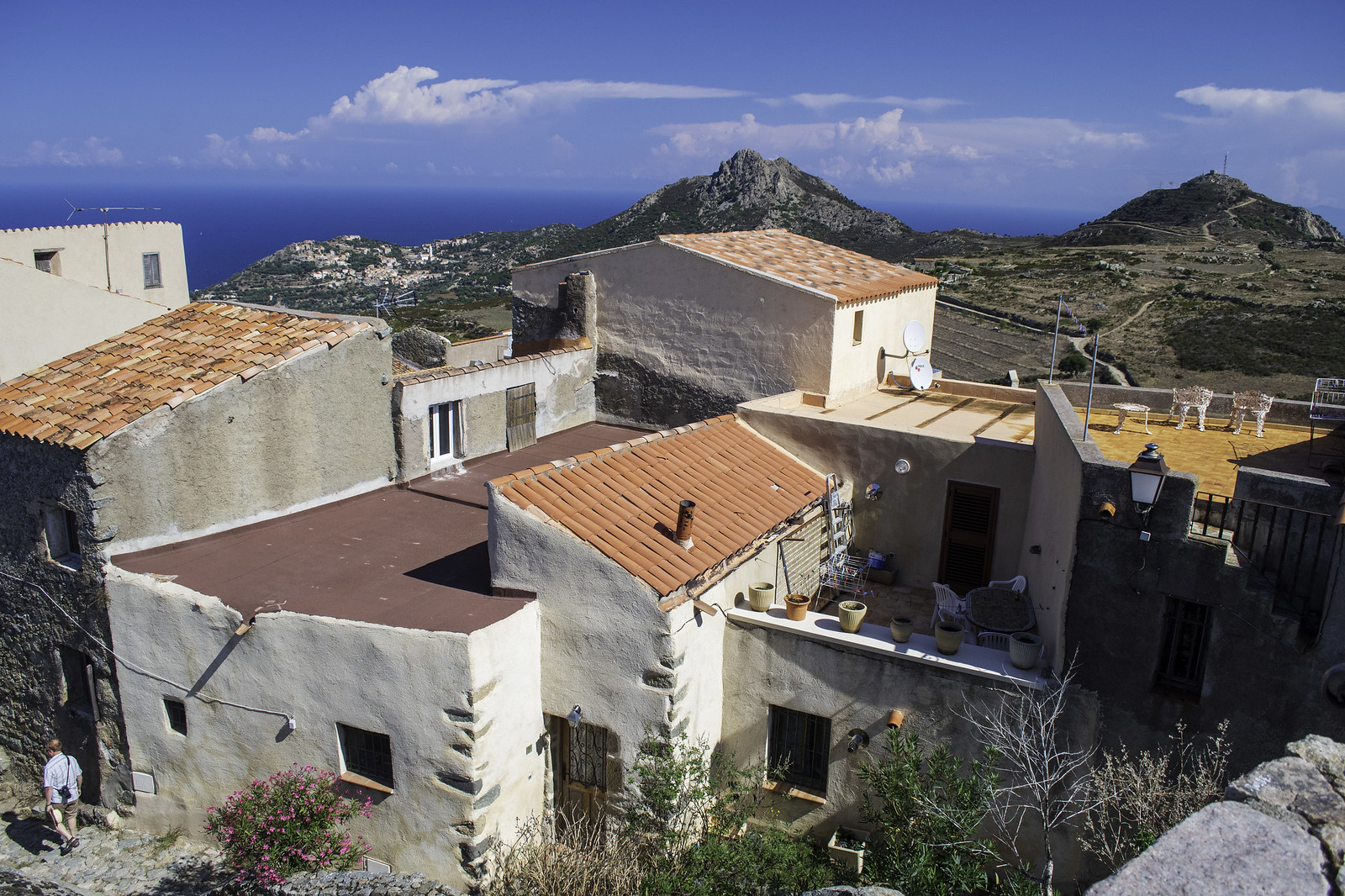 San Antonino
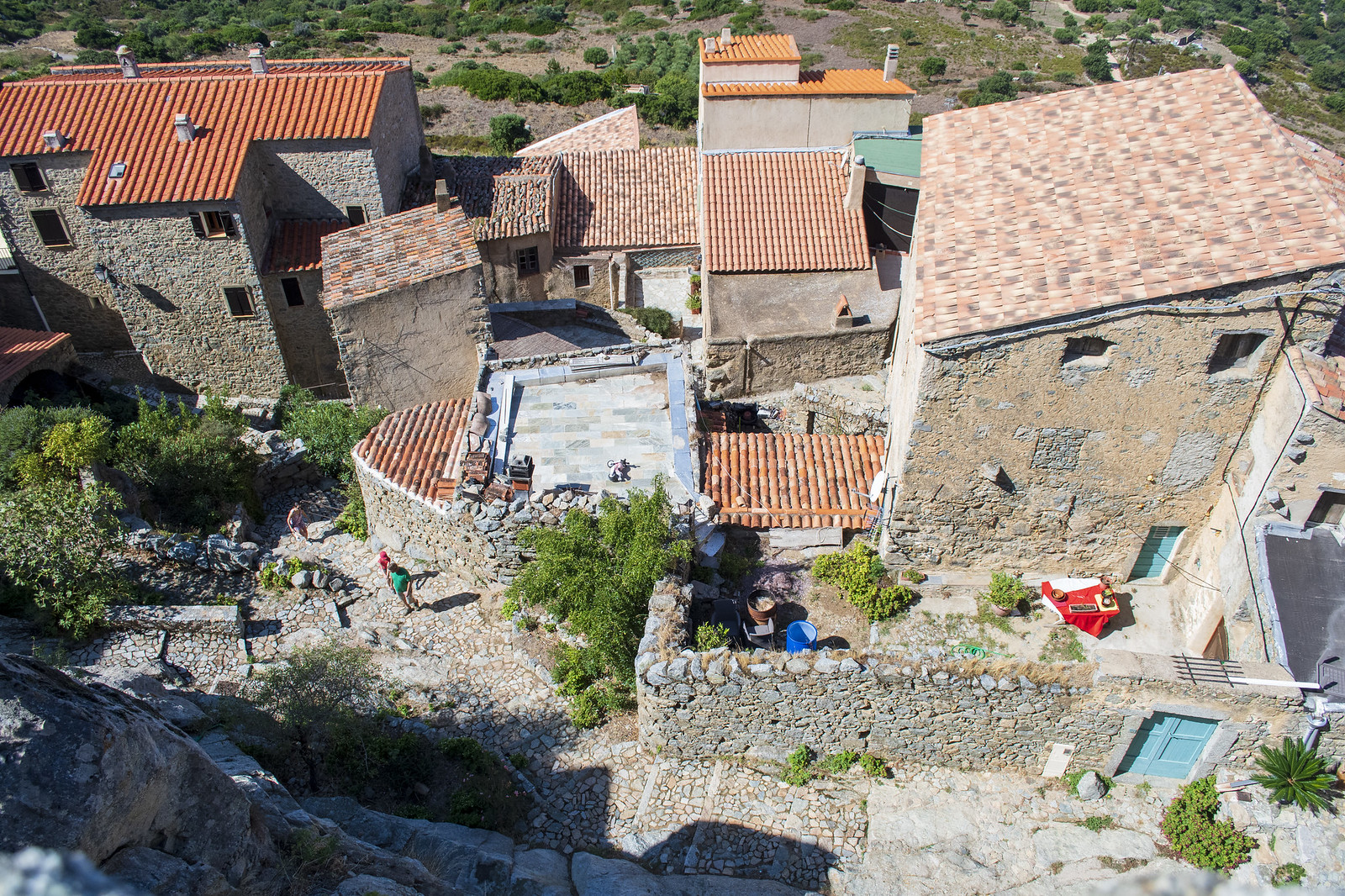 Corsican Rooftops
 _TOM8539
 Charlie 2
John Barry
pfm Member
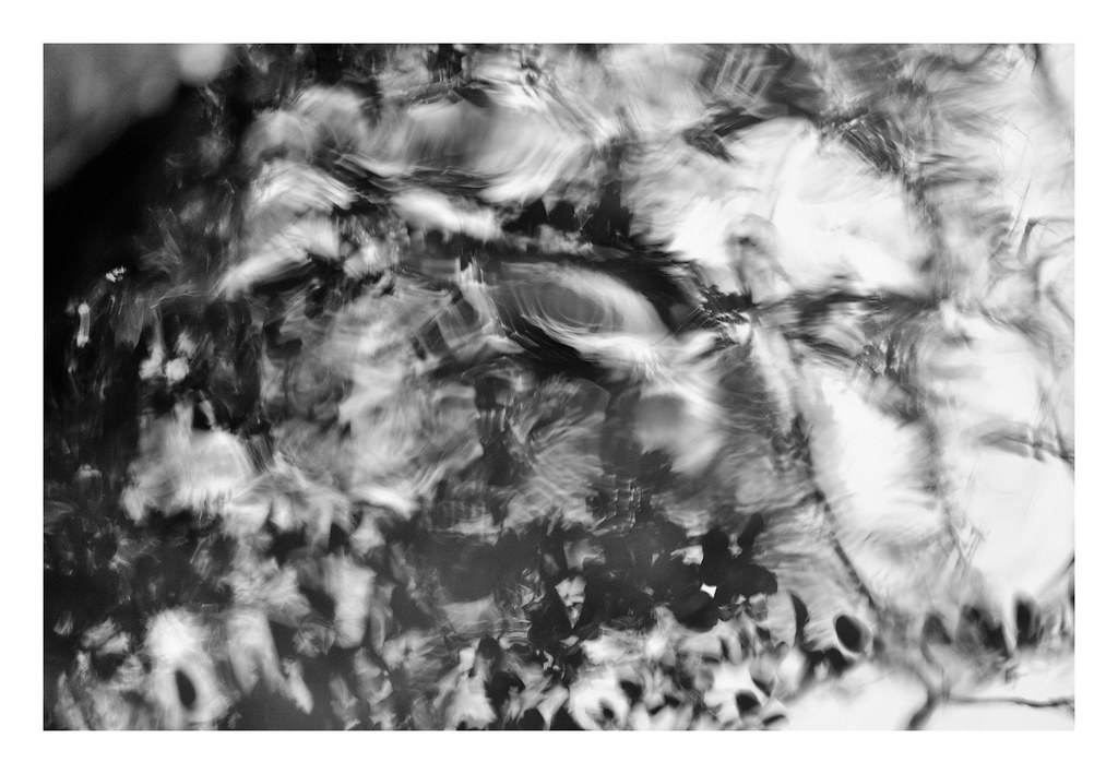
River Test abstracts:

Last edited:
Gromit
Plasticine Dog
 Waiting
ff1d1l
pfm Member
Great shot...Could I suggest a crop on this picture, taking out the lighter coloured bricks on left of picture, with the terrible repair job..(it's distracting) also taking out the first two fence posts...Just my humble opinion...Al...
As suggested, another flypast:

Spiked Again by Mr ff1d1l, on Flickr

Another from London last weekend. I was pretty nervous taking this!

Espresso Bar by Amar Sood, on Flickr
Nikon Z7 / Nikkor 24-70mm f4 S
Lefty
Espresso Bar by Amar Sood, on Flickr
Nikon Z7 / Nikkor 24-70mm f4 S
Lefty
Gromit
Plasticine Dog
Playing with new glass - homework done, now for sunday morning chill time:
 Emma by Boxertrixter, on Flickr
Olympus OM-E E-M1 Mk2/Sigma 56-1.4 DC DN
Emma by Boxertrixter, on FlickrOlympus OM-E E-M1 Mk2/Sigma 56-1.4 DC DN

mad-moon
pfm Member
This looks great...Much better in the portrait format, as opposed to the landscape format...It gives it a lot more impact...and is more balanced with the sunlit wall on the left cropped away...
mad-moon
pfm Member
A real nice photograph..this could have so many titles..a one that comes to mind studying it, would be.. "The Lovers"
ff1d1l
pfm Member
Yeah, actually another, better, shot, and aside from what you say- all good pointers - the diminishing verticals of the highlights do something rather more interesting.This looks great...Much better in the portrait format, as opposed to the landscape format...It gives it a lot more impact...and is more balanced with the sunlit wall on the left cropped away...
Moral - taken on board - don't start just editing your first shot....without due consideration!
Tony Lockhart
Avoiding Stress, at Every Opportunity
I wonder when I’ll be able to take a shot like this again... pants weather this weekend.

Bawdsey beach and cliff just before sunrise.

Bawdsey beach and cliff just before sunrise.
Gromit
Plasticine Dog
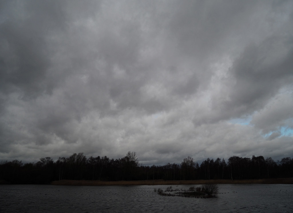
 Calm
Calmeternumviti
Insufficient privileges to reply.
- Status
- Not open for further replies.