You are using an out of date browser. It may not display this or other websites correctly.
You should upgrade or use an alternative browser.
You should upgrade or use an alternative browser.
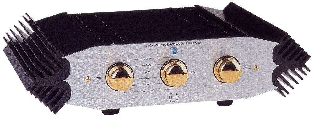
Audio aesthetics disasters : what were they thinking.
- Thread starter AV8
- Start date
Tony L
Administrator
I’d like to nominate every blingy over-sized CNC machined amp/DAC/CD and faceted painted MDF speaker on the planet. Every time Stereophile lands on the doormat I’m just left astonished by how far things have moved from the timeless aesthetic purity of the best of the ‘50s through to ‘70s. Nothing silver looks as anythung like good as a ‘70s Marantz or Pioneer, nothing small-footprint or minimal looks as clean and perfectly designed as a Braun, Quad, Tandberg, B&O etc, and even the companies that could make cool looking statement kit such as Audio Research, McIntosh etc have dropped the ball with little beyond ostentation and vulgarity these days. But the speakers are the worst! I guess the whole painted MDF thing started with Wilson, but they are far from the bottom, there are some quite staggeringly ugly things out there these days to my eyes. We seem to have learned nothing from mid-century modernism, minimalism etc. Modern hi-fi needs aesthetic designers. Desperately.
sideshowbob
Champagne fascia aficionado
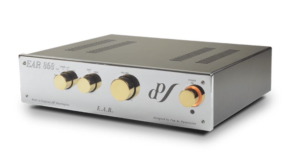
Tim de Paravacini makes great gear, but they shouldn't let him anywhere near the Letraset. The average piece of EAR equipment seems to use about 6 different fonts, and none of them elegant.
But Chord win the "Is it an amp or an air conditioner?" contest. Terrible blingy design that makes literally no sense.
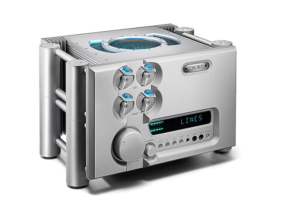

But Chord win the "Is it an amp or an air conditioner?" contest. Terrible blingy design that makes literally no sense.

tuga
Legal Alien
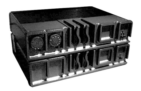
Following on from the SME6 design disaster I'd like to nominate this :
Absolute horror show.

Somewhere between a multifunction printer and a digital scale...
[urlRip=https://flic.kr/p/2jHKAav] C26387E5-A246-4849-95F2-D73E3F92E974 by Anthony Tindall, on Flickr[/URL]
A whole Marantz CD52 resides inside the case work, including the front fascia.
Nasty.
 C26387E5-A246-4849-95F2-D73E3F92E974 by Anthony Tindall, on Flickr[/URL]
A whole Marantz CD52 resides inside the case work, including the front fascia.
Nasty.
Stunsworth
pfm Member
That was exactly the amp I was thinking of when I saw the thread title.
Also a special call out for Chord who have spent decades making ugly equipment - so they obviously like it.
Caledon1297
pfm Member
SNIP
But Chord win the "Is it an amp or an air conditioner?" contest. Terrible blingy design that makes literally no sense.

Wow! That is one fancy toaster!
Caledon1297
pfm Member
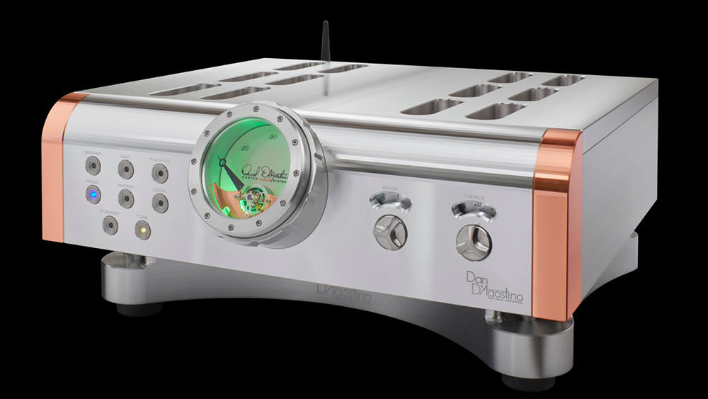
I'm sure some people like it, but I have always thought D'Agastino to be up there in the fugly stakes:


sideshowbob
Champagne fascia aficionado
I'm sure some people like it, but I have always thought D'Agastino to be up there in the fugly stakes:


That is really outstandingly awful, but at least you can use it as a hoover (I assume that's the hose attachment at the front).
Tony L
Administrator
I’m trying to figure out whether a lot of the real high end bling stuff is so loud/ugly/brightly illuminated because it needs to be noticed in some godawful Trump/Putin-style gold oligarch palace. Much of it would never look ok in a typical living room, and I say that as someone with massive 1960s Lockwood studio monitors in a typical three-bed Victorian terrace!
I’m trying to figure out whether a lot of the real high end bling stuff is so loud/ugly/brightly illuminated because it needs to be noticed in some godawful Trump/Putin-style gold oligarch palace. Much of it would never look ok in a typical living room, and I say that as someone with massive 1960s Lockwood studio monitors in a typical three-bed Victorian terrace!
A lot of it is initially impressive, big, bold and expensive looking aesthetically but on repeated viewing wears your eyes out.
Beobloke
pfm Member
Agree on the McIntosh front. Very hard to pick their worst looking TT (there are so many). I think this is the winner though:
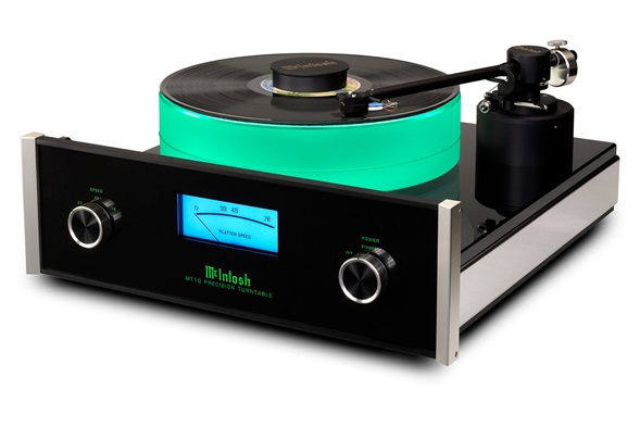
I've said it before and I'll happily say it again - I bloody love that!
Sorry...
jamesd
pfm Member
The average piece of EAR equipment seems to use about 6 different fonts, and none of them elegant.
Audio Note's font choices are terrible. I wouldn't be surprised to see Comic Sans on an amp at some point.
any plexiglass or plexiglass looking stuff is a hard no for me


