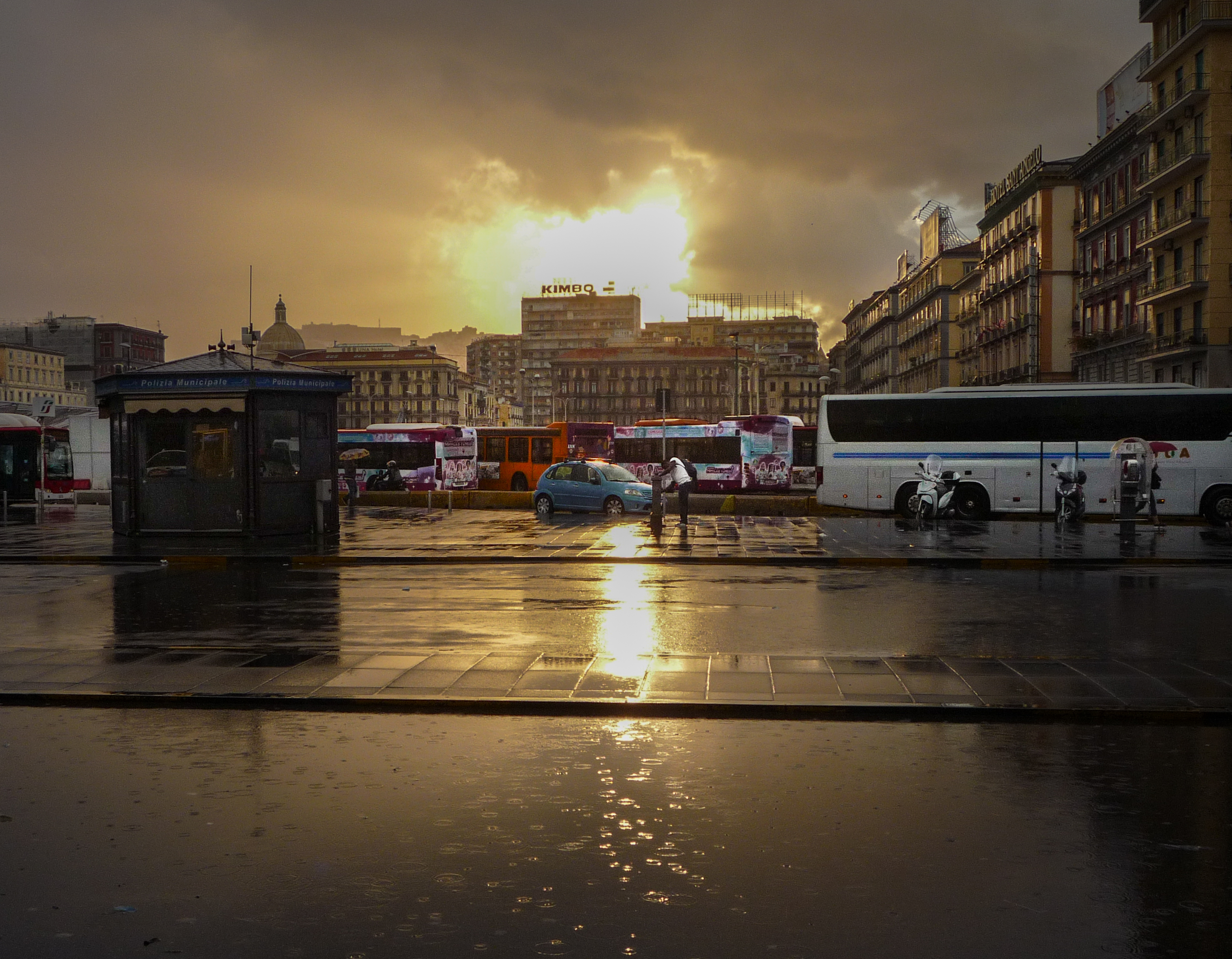
I took a photo in Naples, I rather like it. I don't know anything about Photoshop etc and as it sits it needs a crop and some exposure adjustment. It's taken into the sun and as a result some of the dark areas are too dark and the sky is bleached out by the sun. Does anyone here fancy a play with it to see if it can be turned into anything halfway decent?
You are using an out of date browser. It may not display this or other websites correctly.
You should upgrade or use an alternative browser.
You should upgrade or use an alternative browser.
Tarting up a photo from a digi compact
- Thread starter stevec67
- Start date
martin clark
pinko bodger
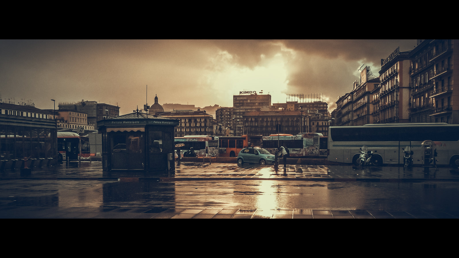
Great news, thanks gents. Thanks especially to Martin for hosting, he has it now. The view is of Piazza Garibaldi as you step out of the railway station at Napoli Centrale so it's the first view lots of people get of the place. I love Napoli and it's very much "you have arrived" when I see this. As I've said to Martin, the bits of it I like are the Kimbo sign (Kimbo is "Il caffe di Napoli" so it's a marker just like the Eiffel Tower is in Paris), the light behind it, the light on the buildings to the right, and the rain in the puddle in the foreground. The bits I don't like are all the junk to the left of the domed roof on the left skyline, the underexposure in the square, the junk on the far right and so on. Can't do much about the buses, it's a city. That's part of it.
As an aside, I like Piazza Garibaldi. It's a grotty bit of town but much better than it used to be 10-15 years ago. I've got to know it, there are streets you avoid, certainly after dark, but it's got a lot of life going on. You need a bit of grit in an oyster, that's what gives you a pearl.
As an aside, I like Piazza Garibaldi. It's a grotty bit of town but much better than it used to be 10-15 years ago. I've got to know it, there are streets you avoid, certainly after dark, but it's got a lot of life going on. You need a bit of grit in an oyster, that's what gives you a pearl.
martin clark
pinko bodger
martin clark
pinko bodger
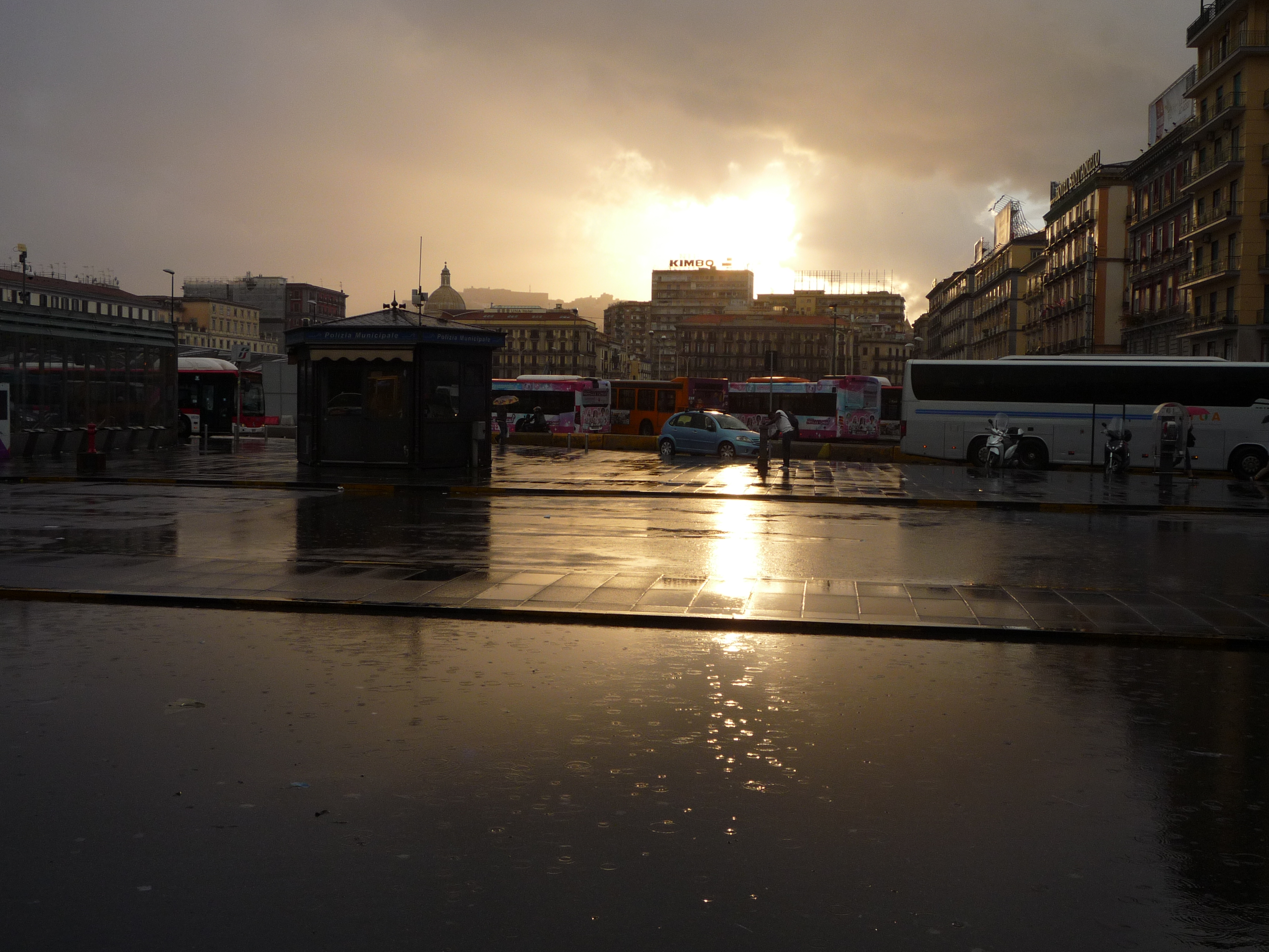
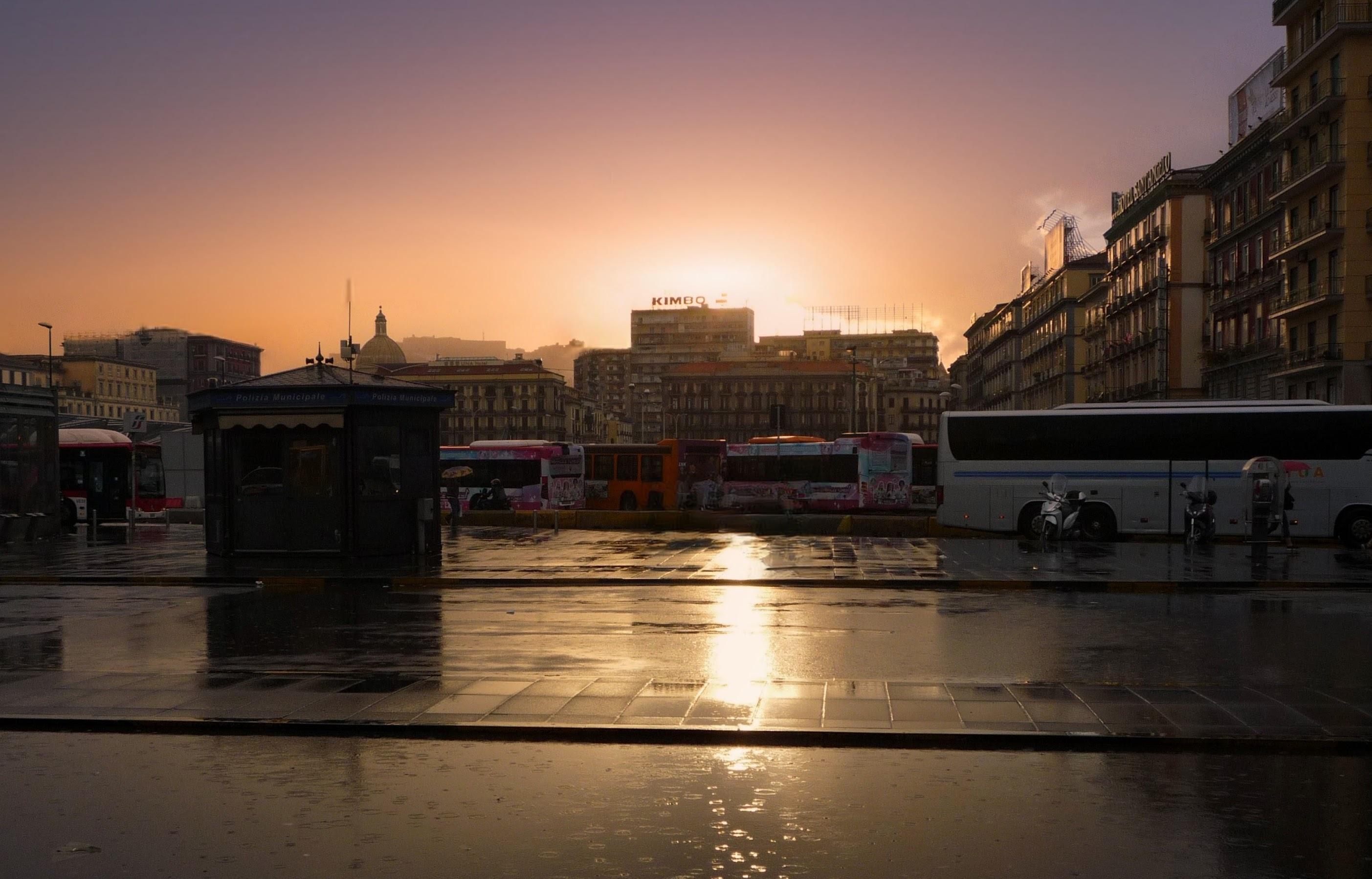
Okay..someone has to go first, so now dinner is done, I will:
5mins effort - my thought process:
first draft, done: [300dpi so 1000 x 1500px.]
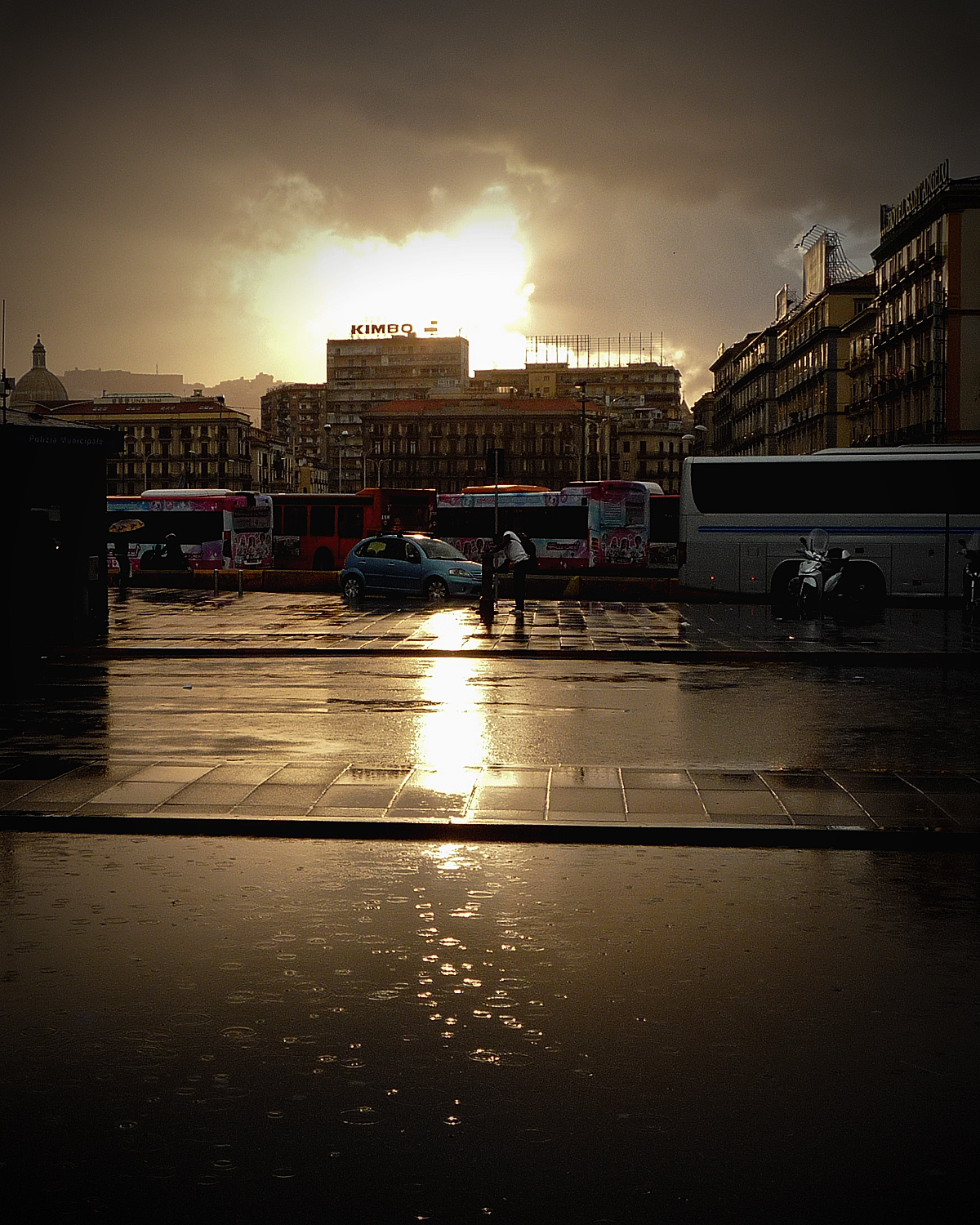
5mins effort - my thought process:
- The burnt-out white space is unrecoverable, so massage white-point/general contrast around that. Push the Black level, just a hair.
- Rotate to adjust but not over-correct verticals vs horizontals; I used 1.5dgree CCW.
- Steve's expressed preference for what matters in-frame then to me suggested a 5/4 crop, vertically. Play with that to finesse losing detritus like the aerial just left of the dome, vs keeping a bit of architectural structure on the right. Place the crop so the foreground is a big part , the sky less so; Kimbo sign right around 1/3rd frame is a happy result. so is teh big bus receeding on the right edge. as a result, the graffiti and colour on the vehicle across centre-frame comes forward/ adds a layer I like, but didnt see at first.
- Make a virtue of the bright light behind the Kimbo sign - easiest way to do that is to add quite a strong vignette that makes it step forward/fits the dark theme / draws attention to that which is good in-frame. Highlight detail was never there, so celebrate it.
- There's virtually no colour adjustment after this at all/ the tiniest amount, <3%of colour-contrast massage in colourFX; only enough so that the colour-pallete looks consistent, not loud overall.
- Output sharpen - on the soft side, I hate the opposite, and the raindrops wont forgive a tool so often over-used. They are subtle.
first draft, done: [300dpi so 1000 x 1500px.]
martin clark
pinko bodger
...Over to everybody else for their perspectives & creativity!
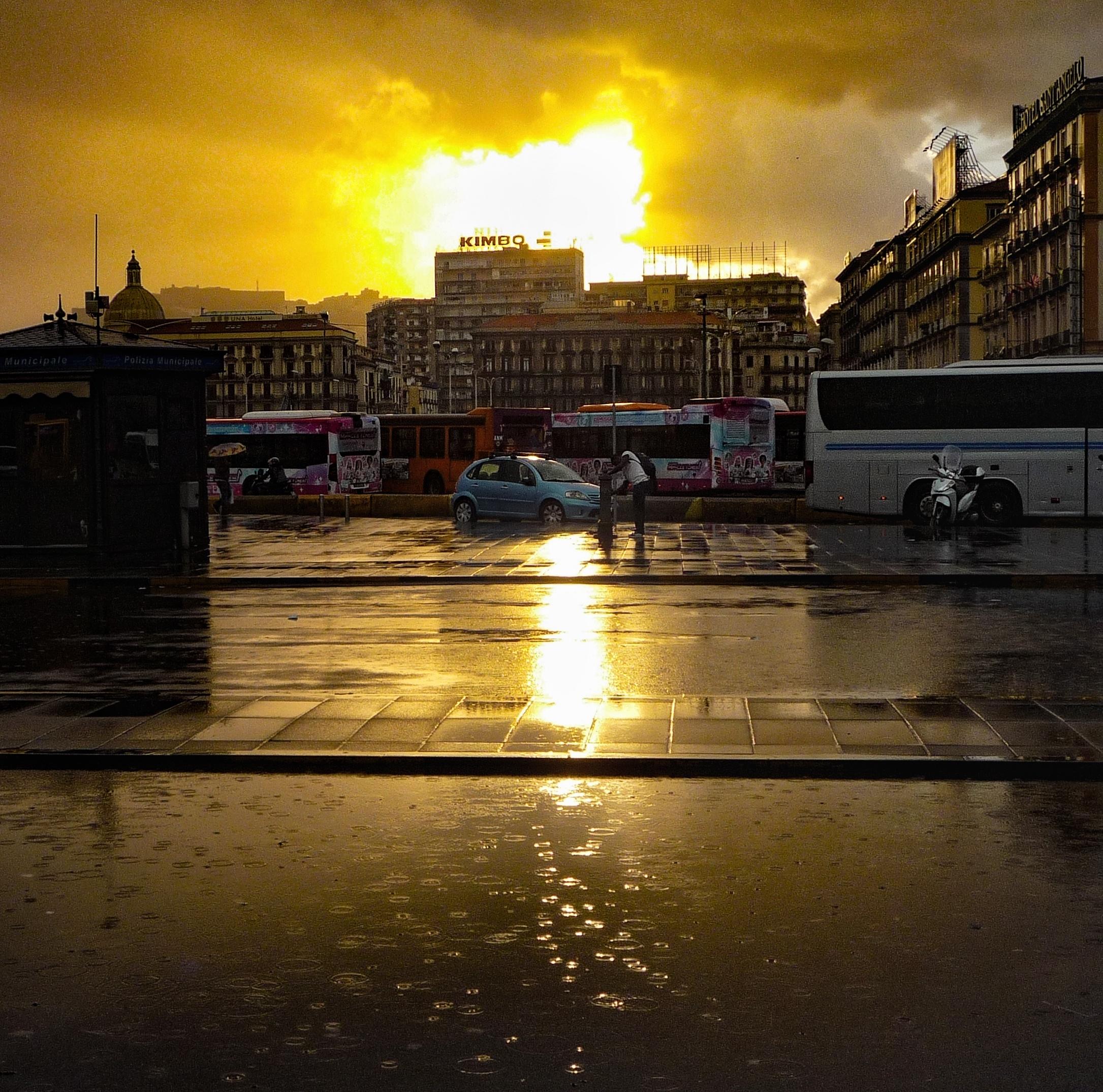

Interesting, AI at work?
")
Funk
pfm Member
Yes, done on a Pixel 8 Pro. A little 'quick and dirty', I'm sure the Photoshop experts do far better work but for a phone I think it's a decent enough output...Interesting, AI at work?
Last edited:
Hoopsontoast
pfm Member

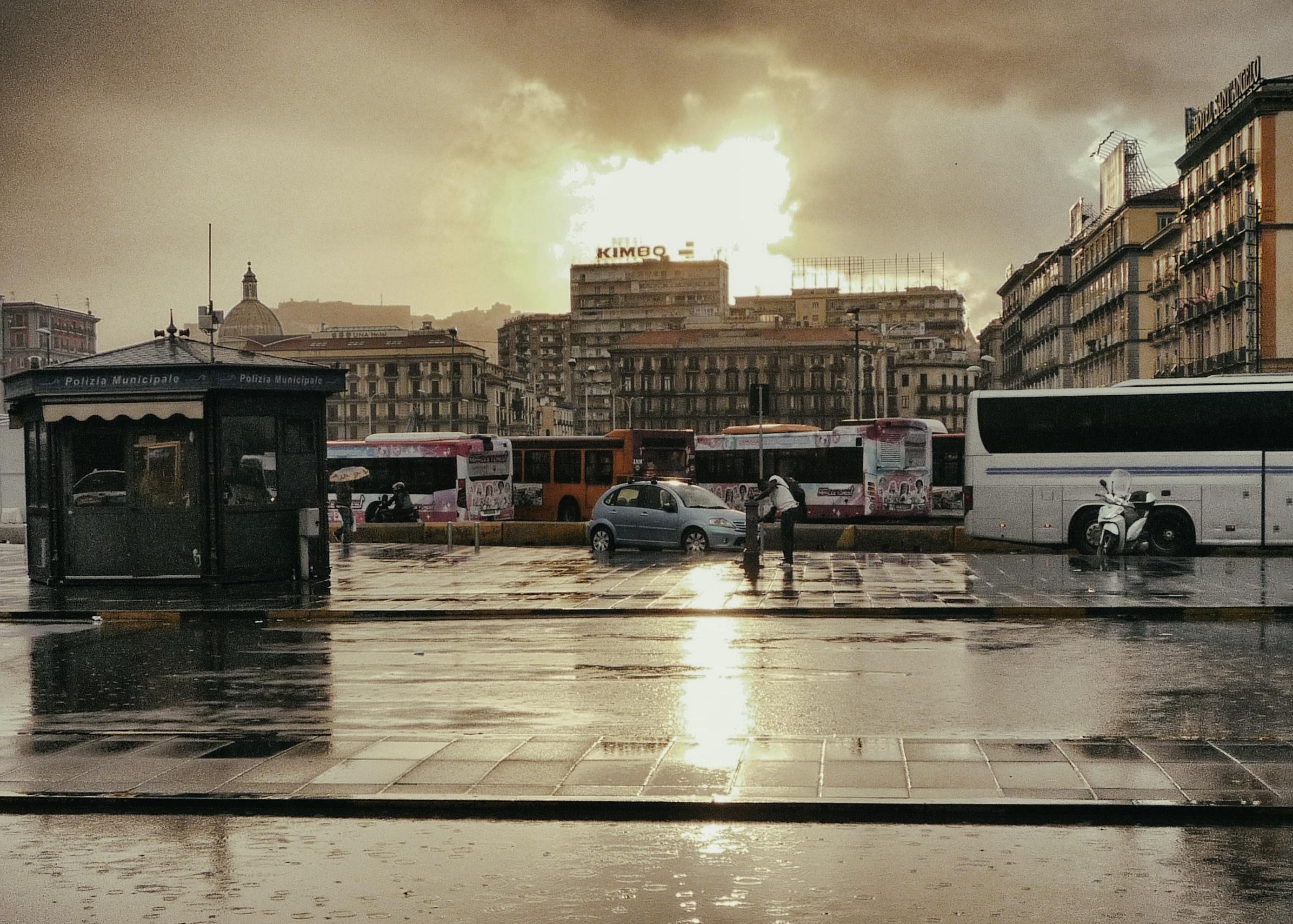
If it was mine I would concentrate on the bits that interest me something like this:

P1010011 by idomy best, on Flickr
P1010011 by idomy best, on Flickr