advertisement


Gear you can't stand the look of

A lot of folks hate these but, honestly, it looks just fine in a rack. I like the art deco styling myself - anyway mine's a keeper :)

iu
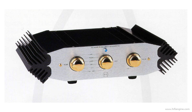
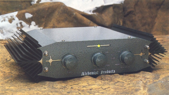
Looks like the control part of our Beko range!
 
I'm not sure about the Chord Desktop styling but I do like the full width stuff (I own a Chord pre/power with integra legs so I obviously like my bling!:cool:). The styling is apparently loosely based on Gaudi architecture as MD John Franks is an aficionado.

My idea of hifi tedium is a rack full of plain Jane boxes. I remember a visit to the Arcam factory where I noticed that the more expensive amps looked identical to the cheaper models aside from the box size. Nice company and decent sounding stuff but I wouldn't have anything like this in my system. For me 'high end' audio should make a statement both sonically and visually.
 
Generally anything with cheap ott chrome/mirror finishes, The Roksan K2 stuff reminds me of the proliferation of cheap DVD players that flooded the market in the early 00s, horrible.
 

Strangely enough... many have mentioned to me over the years that one of the main reasons they bought one was that they loved the looks! Earlier ones were a dark green Hammerite finish and more tasteful.

I hate blue LED's and don't get the love for them. I've had a few items of Alchemist kit in with a request to change all the LED's to blue so they match! (something I couldn't give a toss about personally).

I don't like the blingy Magpie bothering style of Alchemist gear but our biggest sales were exports to the far east and that's what they like over there.
 
I have one of the green Hammerite ones, I love the look, no bling thing on that one. I Even made some descending Fin style legs for it , looks even more wacky.
 

These were so ugly that they were almost beautiful again!


Ugggggghh, possible winner there!

For me all the new Chord stuff, hideous.
The majority of valve amps.
Plus most of the modern gear that has hugely crafted billets for front panels along with casework designed to try and justify the ridiculous prices said kit retails for.
I agree with the shoebox Naim gear and of course the biscuit tin Exposure of old. Exposure were forgiven as their stuff, sonically speaking, was just such good value.
 
Always loved classic Quad styling (and still do) but can't stand the 77 and 99 series - just plain ugly in my book

quad_77_integrated_amplifier_77_01_2479361.jpg


106quad138705.jpg


... although the 909 escapes my ire ;)
 
Any AV Receiver - massively oversized in comparison to normal hifi gear and usually have some form of hinge plate on them.
Any valve amplification that uses valves as a visual feature and nothing else.
 
Any AV Receiver - massively oversized in comparison to normal hifi gear and usually have some form of hinge plate on them.
Any valve amplification that uses valves as a visual feature and nothing else.

There were some really naff plasticy Luxman integrated amps in early 90's with a perspex window on the front panel so you could see the single valve glowing! Yuk


advertisement


Back
Top