martin clark
pinko bodger
You're really weird
Sandy.
I like the one with the red background. But that's likely because I'm a sucker for clean, minimalist images. I also feel the composition is slightly better as the bowl is further from the edge of the frame and this allows it space to breathe and also doesn't cut the shadow off.
Lefty
bottom one...hands down...it's so much more natural and the colours will also be nearer the mark, knock about 10-15 off saturation for my eyes...a pleasing image...
have you tried using a grey card when metering and using your meter lock
I see all the above, but strongly edging toward Lefty's view: my feeling would try the red but a rather tighter crop, to make the subject & workmanship 'pop'. Think 'postcard punch' rather than full-frame, careful photo in complementary tones; that's not what I see in the subject.
- which is lovely handiwork, as ever.
")

 Emma
Emma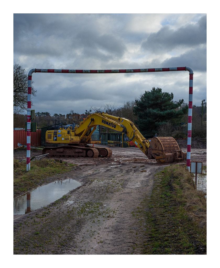
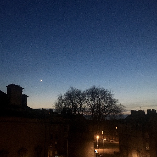
 Light Canon
 Sunday morning
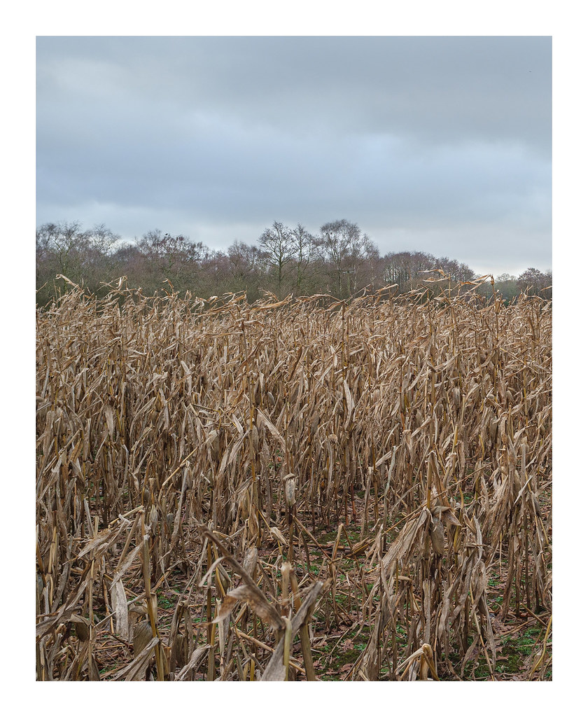
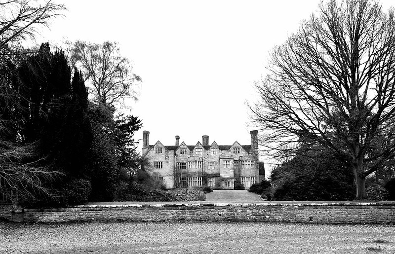
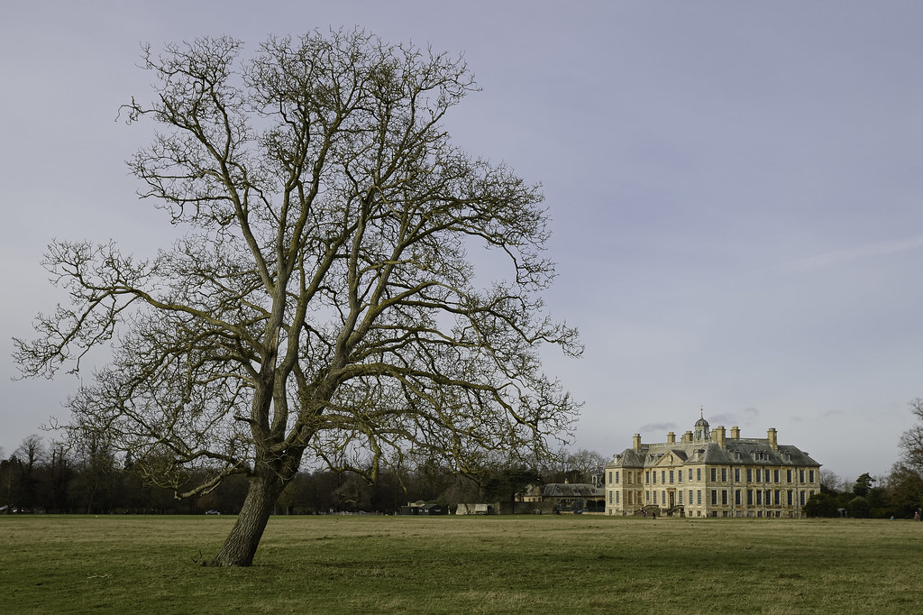 Belton House
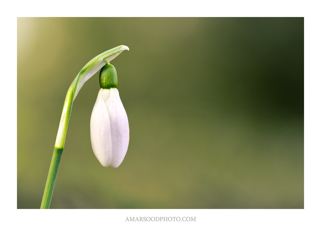
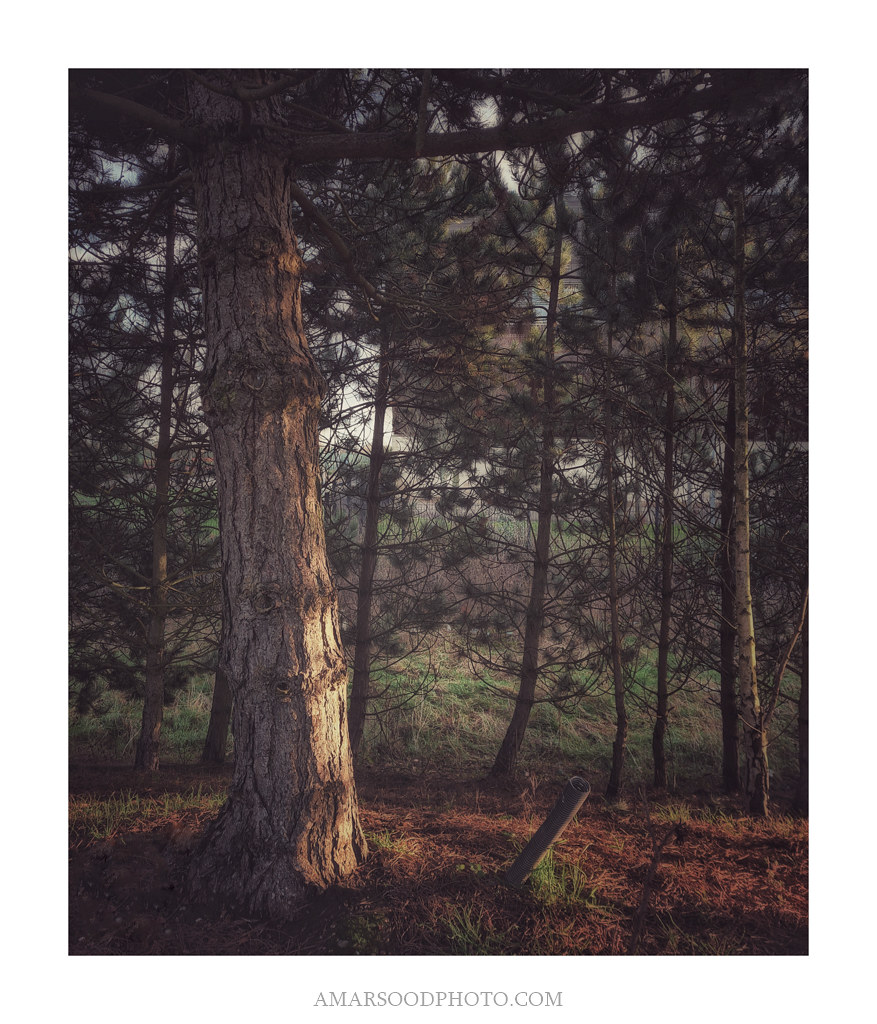
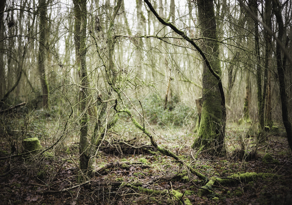 Gnarly wood
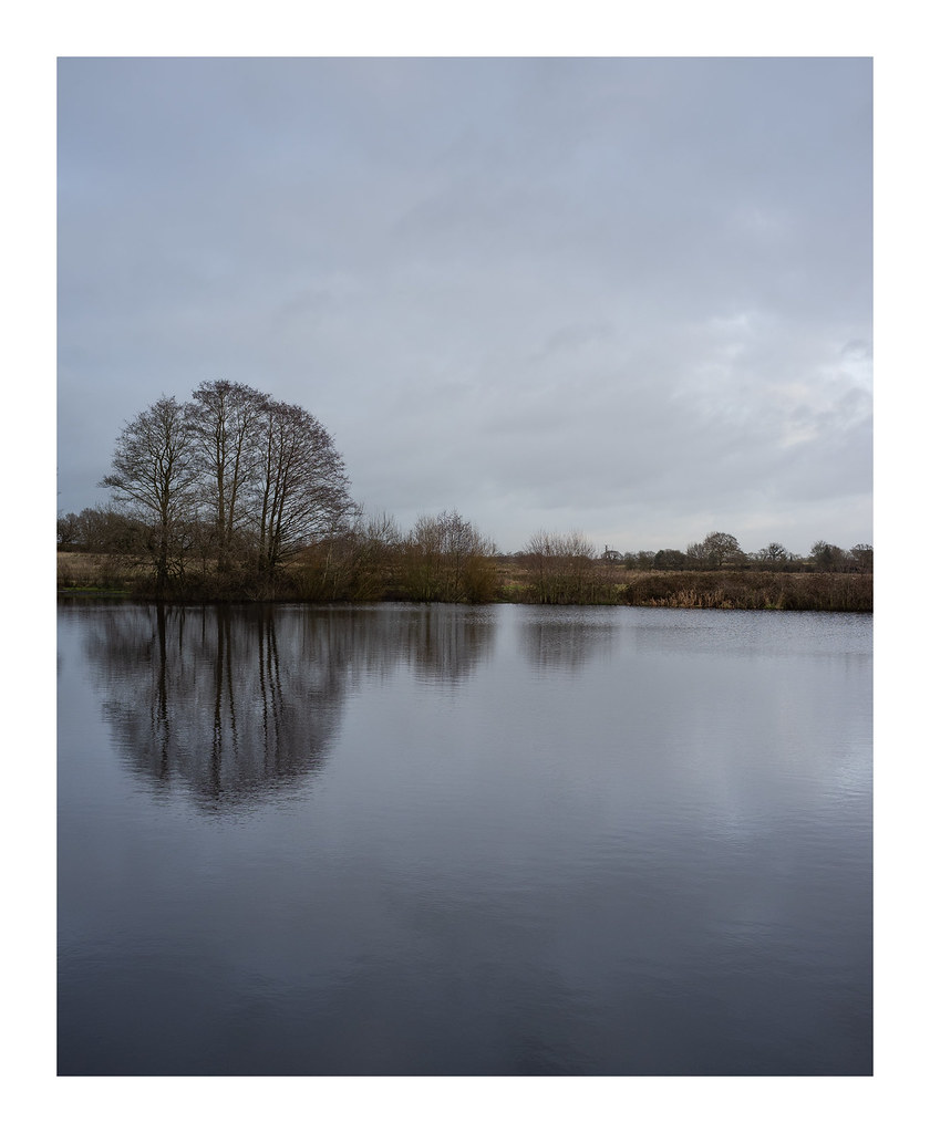
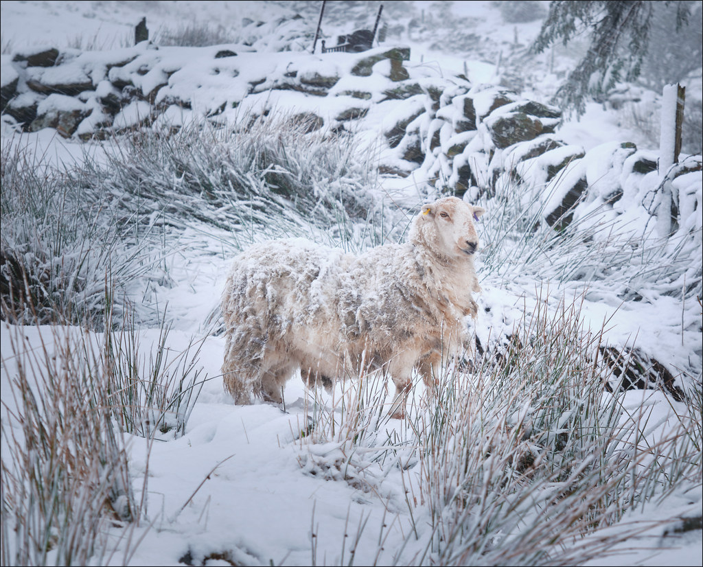
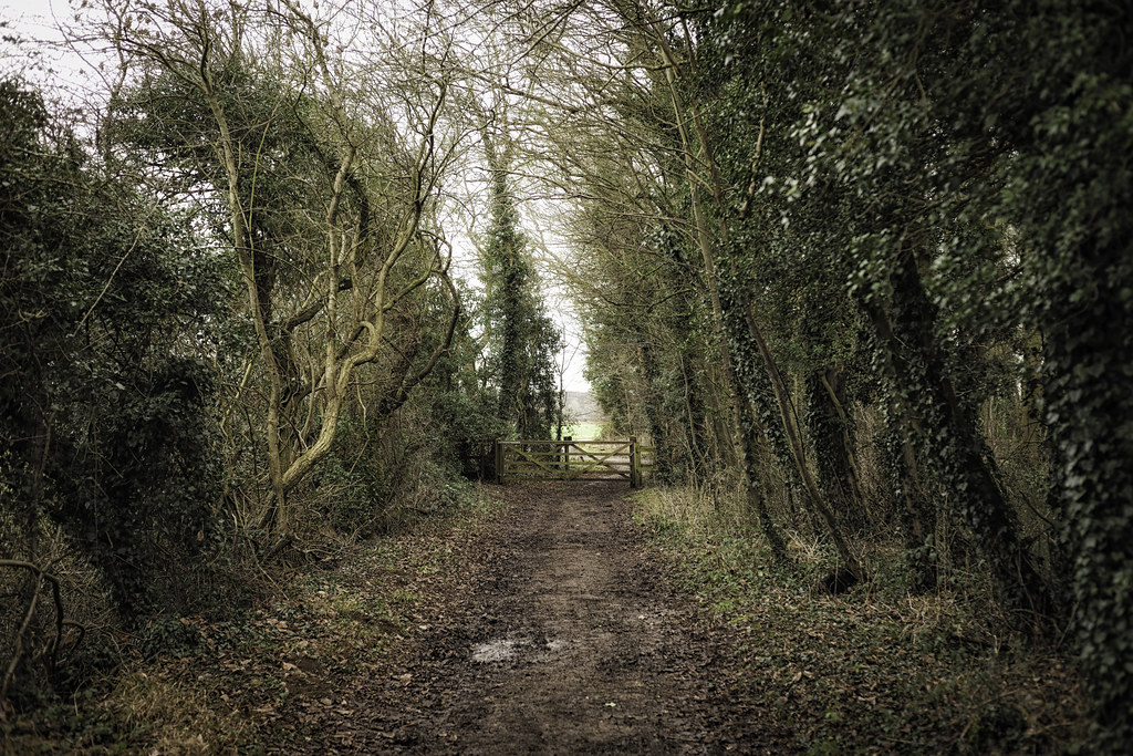 Way out