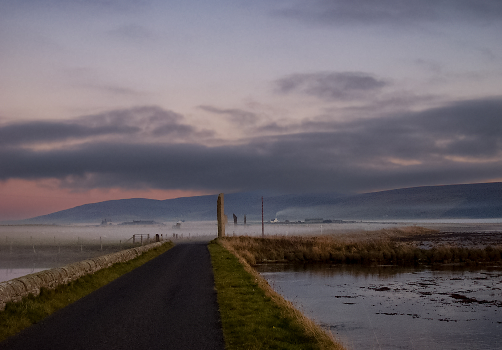
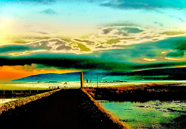
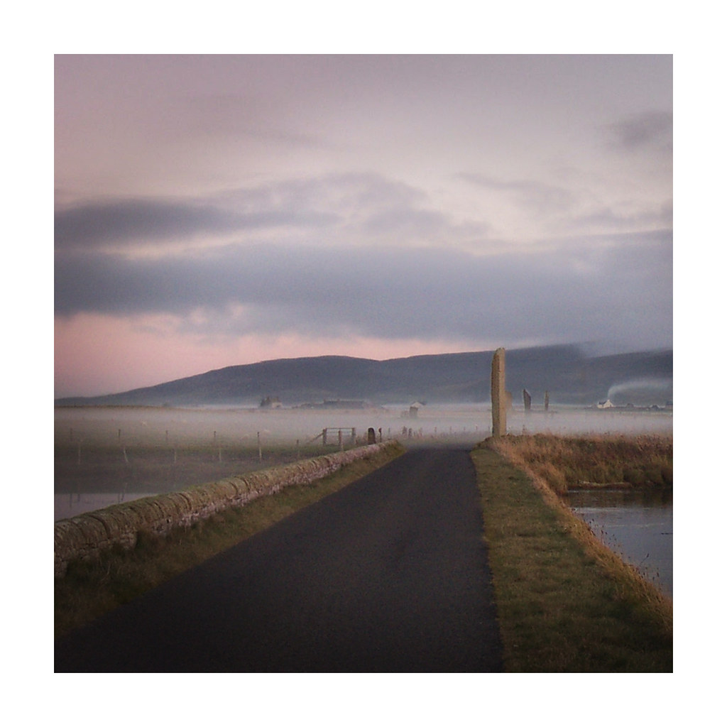
Straightened up the horizon, took out the red blob, darkened the sky with a mask, deepened the blacks to make the road seem less bland, added some 'clarity' and 'dehaze' and a touch more vibrance in Lightroom, sharpened to whole image a touch but denoised the sky. Cropped to get the roadway more central and added a small amount of post crop vignette.