advertisement


Help Reiki Audio choose our Made in Britain logo!

TheFlash

Reiki Audio
screenshot-2023-11-24-at-12.03.06.png


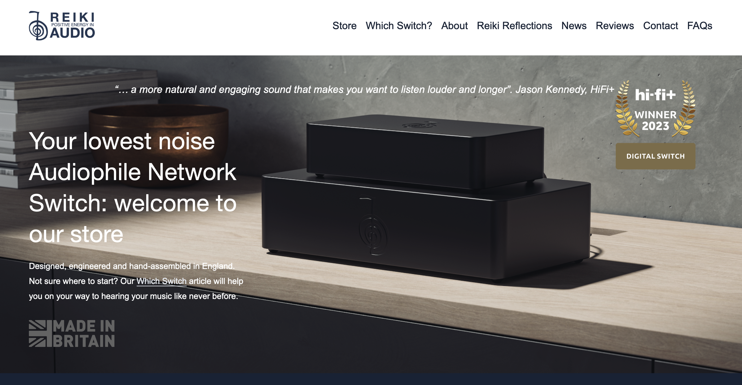
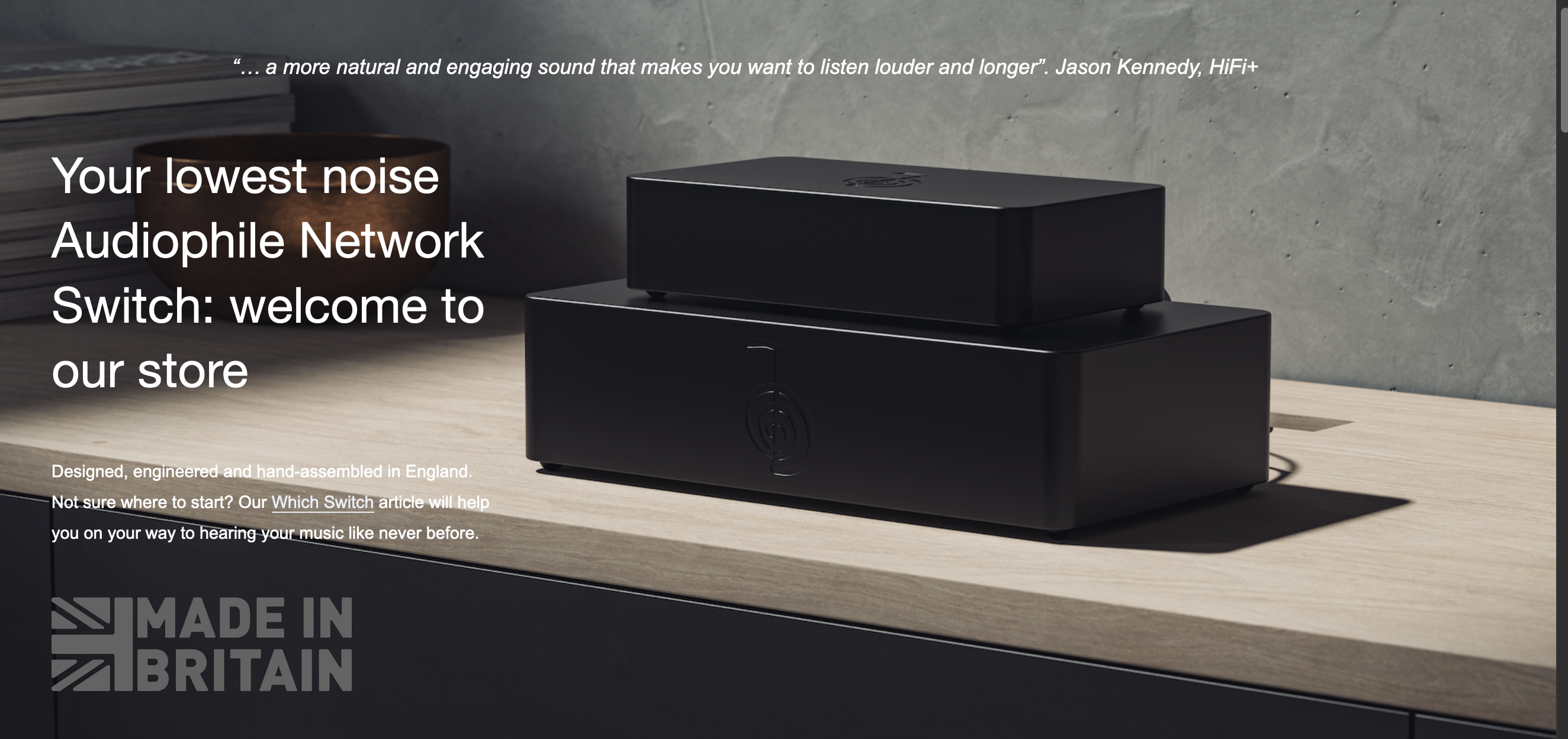
At Reiki Audio, we have always shouted loud and proud that our products are designed and handmade in England to be enjoyed by customers anywhere in the world. Being close to our component designers and suppliers allows us slicker communications, closer attention to design detail, faster refinement of prototypes into production designs, and close oversight of manufacturing processes such as those of our gorgeous milled and anodised aluminium cases.

We’re delighted to announce that we have just been approved as a Made in Britain manufacturer, allowing us to use the Made in Britain logo. The key requirement here is that a minimum of 80% of a company’s value chain must be in the UK. As our aluminium cases are milled and anodised in the shires, our shipping cartons are made to order here, etc we applied with confidence. We hope more UK hifi companies will examine their own supply chains and join us.

Now… which logo to use? Decisions, decisions

www.reikiaudio.com
 
Last edited:
1 and 2 look best to me, the choice depending on the background. The colours in 3 are too bright and dominate the grey font. But with white text it might work better. Try using the flag colours on option 1 - that might draw attention to the point on packaging and promotional material. But plain 1 or 2 on actual hardware.
 
I think they all need tweaking...

As they stand, shown in the banner, the first reads the easiest.

Second is dull, though they grey could be replaced with silver.

Third needs some white in the flag - but would still look like an Army logo.

Fourth is weakest; the 'box' it sits in it far too tight in the way its crops top, bottom, and on the right. The lettering needs more 'space' around it.

For all of them, I'd give more space between the flag and text. Even the spacing between the 'B' & the 'R' is greater. Probably also consider another font - could still be a Sans but perhaps more refined? More modern and slender perhaps?

It's also crucial that you know what colour background it will sit on. That's why, in what's presented above, the first version reads best, and the last, worst...
 
Thanks for these thoughts @robbyd. Unfortunately the logo is the logo so I can't do anything about fonts or spacing if I'm to use it... though as a friend suggested, I could just make up my own logo and do what I want with it!
As above, it sits in my header ad so I think the grey works as well as any: I do really like your idea of silver though, so will see if there's anyway I can use Inkscape or similar to reconstruct in a different colour. Nice one.
👍
 
If it just appears on a screen, silver can be done as an airbrush effect of varying grey tones. There's no such metallic colour in RGB.

If you send me the file or whatever you have for the current logo, I'll try and do something but can't promise a timeframe.

All the best
Rob


advertisement


Back
Top